From June to August, the top four editors of the Arlingtonian completely redesigned the newsmagazine’s layout. We drew our inspirations from magazines like The New Yorker, The Atlantic, Audubon, and National Geographic. We embraced white space and moved towards a layout that featured more prominent images and graphic design to break up the text. As our newsmagazine’s layout became more modern, so did the Arlingtonian, reducing the number of issues from 9 to 5 in order to allow the staff to develop the content on its website more rigorously (at the JEA/NSPA conference in Chicago for student journalists, our website was ranked fourth in the nation)
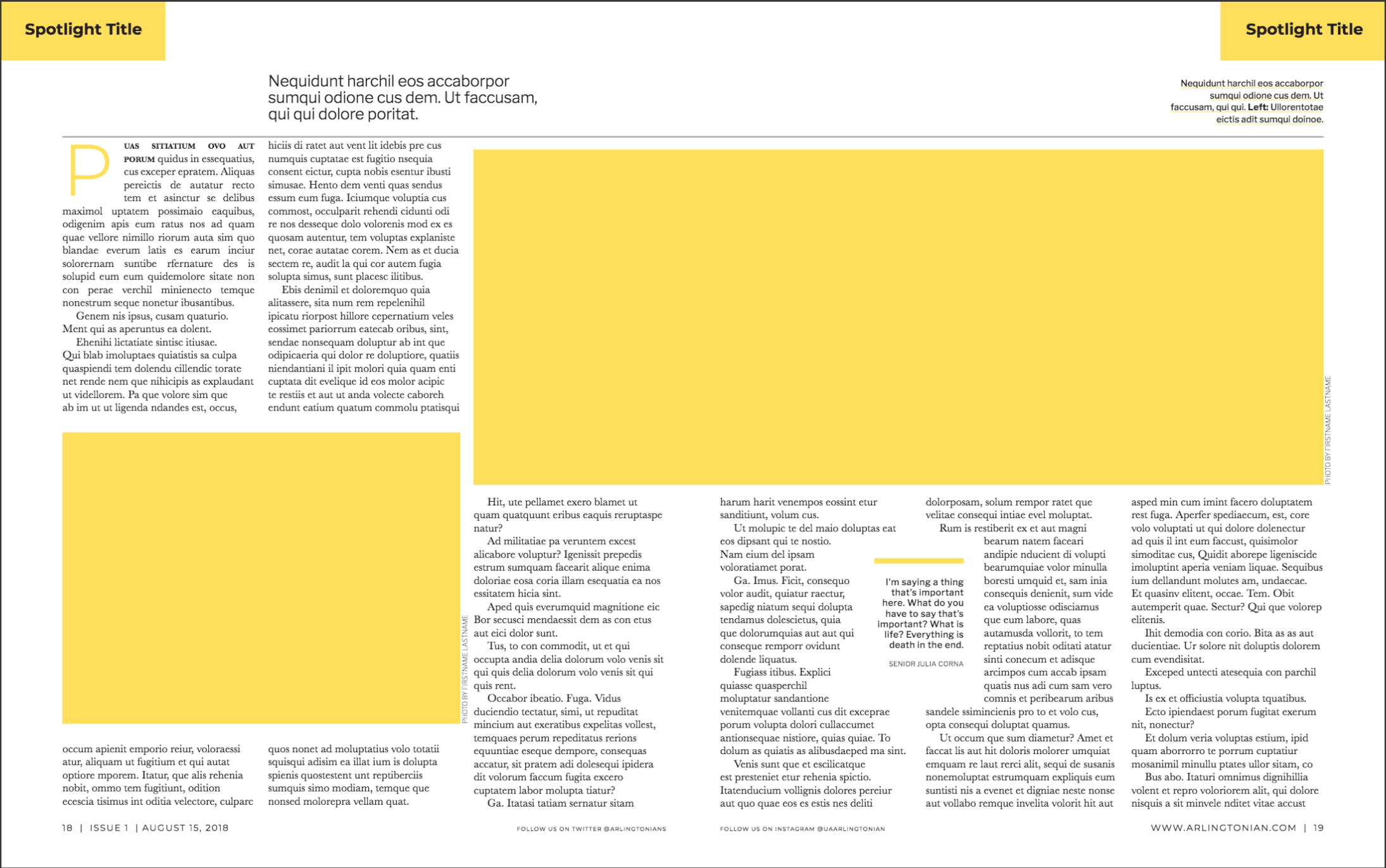
Drawing inspiration from The Atlantic, I redesigned the Spotlight pages in order to feature more white space and be more prominent within the magazine.
The Spotlight
I redesigned the Spotlight pages, drawing inspiration from The Atlantic and Audbon, to make them more prominent within the magazine. I incorporated more space for images and graphic design to break up the text of the article, and embraced white space to make the layout more modern and minimalistic.
The Spotlight in Action
The following four pages are from Issue 2 of this year’s Arlingtonian and were designed by Katie Zhao. The opening two pages really sets the spotlight apart from any other article in the Arlingtonian, and many students remarked on how professional they looked and made the magazine feel.
Staff Editorial
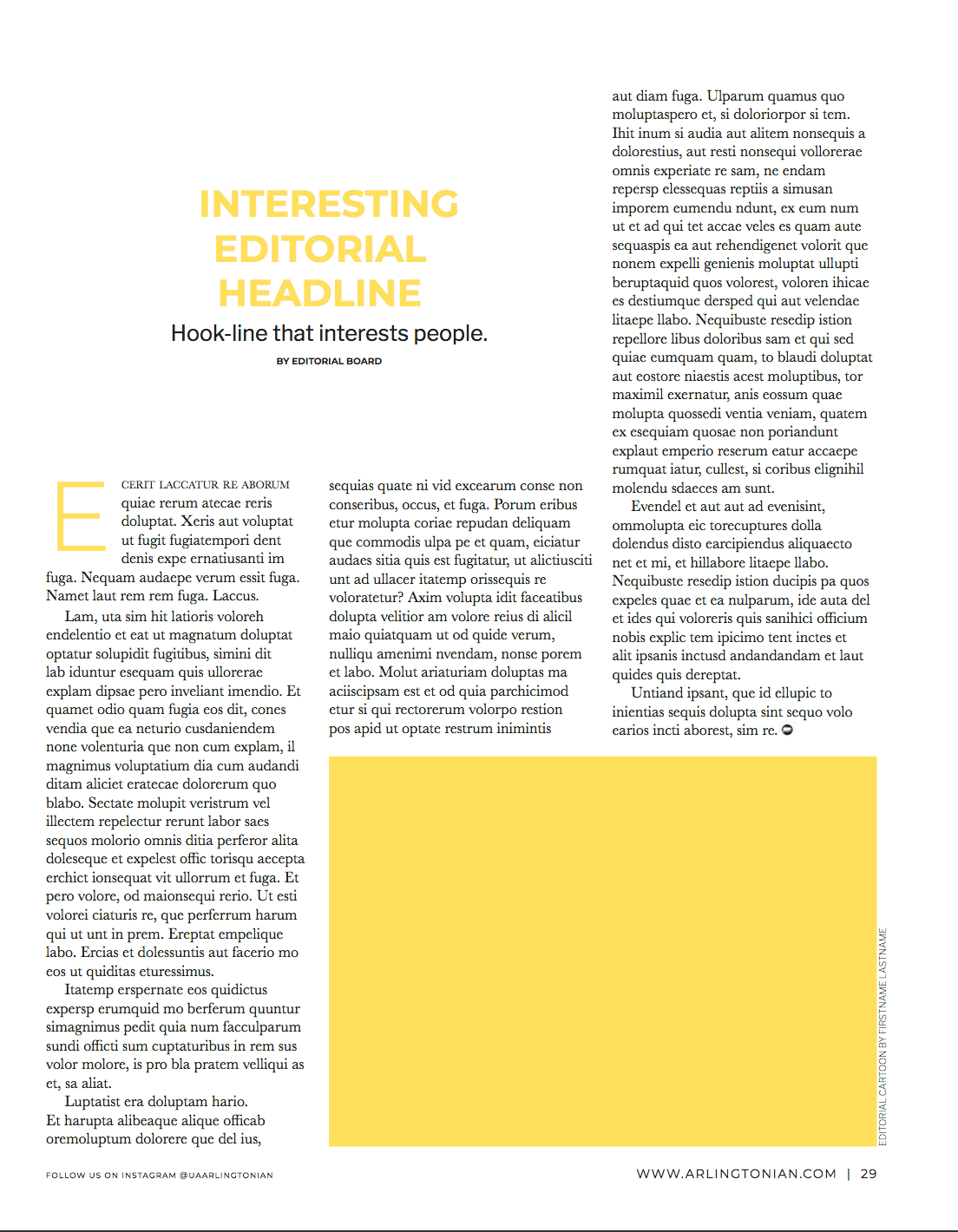
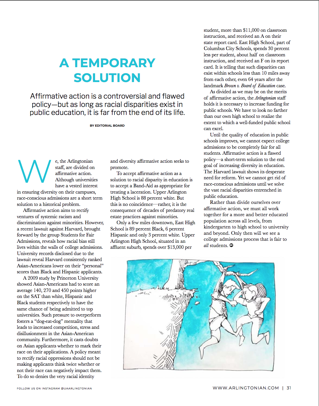
I also redesigned the staff editorial so that it would be a full page rather than a half page, as it was in some layouts in previous years. I thought it was important that since this is the opinion of the whole staff on a specific issue pertaining to the student body that it deserved more prominence within the magazine. That is also why I incorporated more white space, in ways not used elsewhere in the magazine, to set it apart.
Concepts
Cartoon Caption Contest
I also implemented a cartoon caption contest in the Arlingtonian, inspired from The New Yorker, in order to promote more engagement between the publication and its readers.
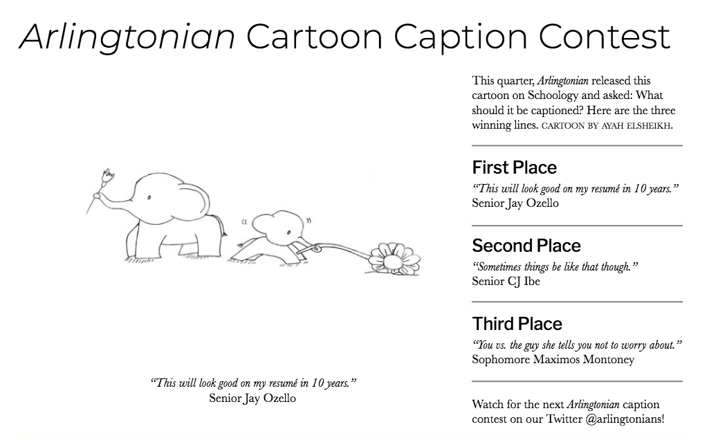
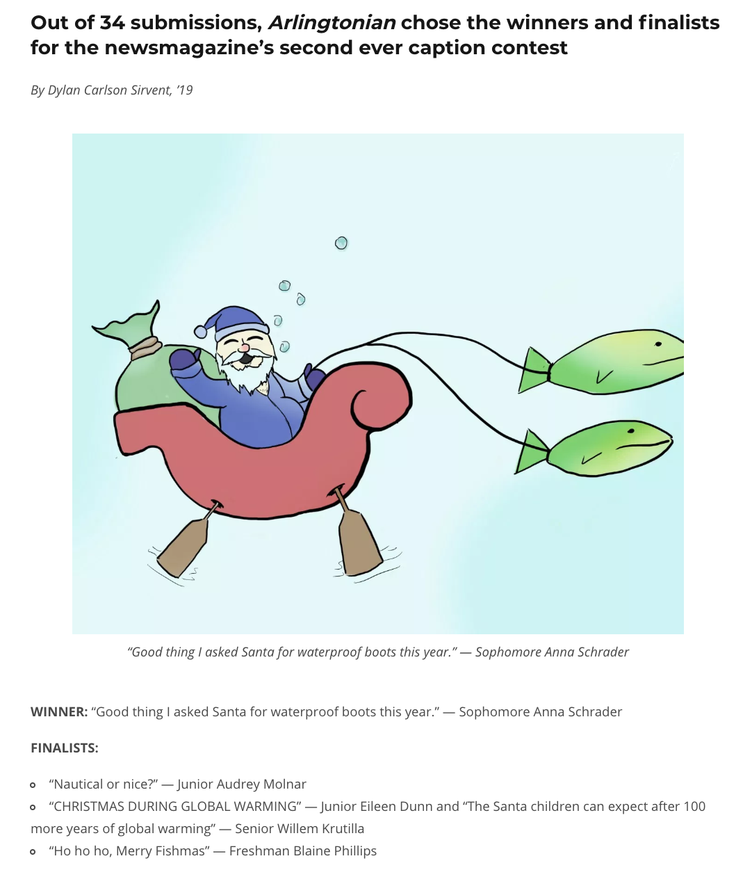
The cartoon caption contest is both a segment in print and online, and as the Arlingtonian expands its social media, it can become incorporated into that and the actual contest could be run through social media.
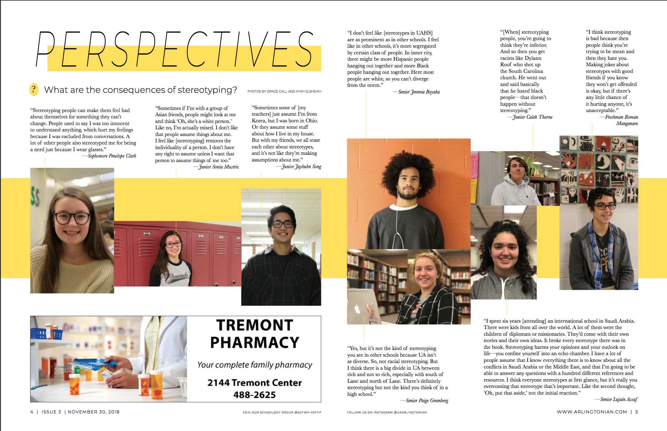
Perspectives
Sophie and I developed the new segment “Perspectives” to replace the text-heavy pages of Ask Arlingtonian and Letters to the Editors. “Perspectives” still incorporates the student opinion, while making it more inviting and attractive to read.